Contents
Introduction: CSS for eCommerce
Have you ever been to an online store and been amazed at how the products were laid out? That is the magic of well-designed product grids and cards. These are the building blocks of any eCommerce site, providing a clean, organized layout for showcasing products effectively. In this article, we discuss how to use CSS for eCommerce website design.
A clean product grid allows users to screen through items quickly, get what they want, and make purchasing decisions easily. A beautiful layout creates trust and maintains the user’s attention.
You don’t know that design drives purchasing decisions. A polished grid and card design subtly influence users to add items to their carts. Clear images, short descriptions, and a prominent call-to-action button work wonders here.
Essential CSS Concepts for eCommerce
Knowing the CSS box model is basic. It describes how margins, borders, padding, and content combine to create a box around HTML elements. Mastering this ensures precise control over layout spacing.
Flexbox is ideal for one-dimensional layouts, whereas CSS Grid is a powerhouse when it comes to two-dimensional grids. Melding the techniques will get you intuitive and flexible designs.
With mobile shopping on the rise, your design has to be responsive in various screen sizes. In that case, media queries, flexible grids, and fluid images are your best friends.
Designing Product Grids with CSS
Start by creating a very basic structure with divs for the grid container and items of products. Keep your HTML semantic, using `<section>` and `<article>` tags where appropriate.
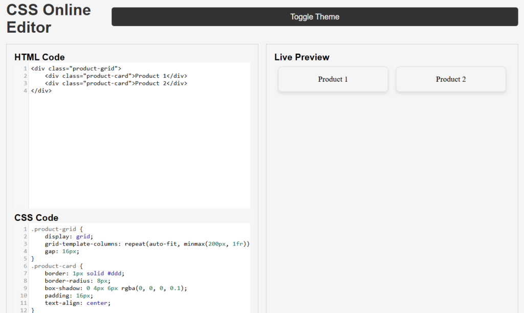
<div class="product-grid">
    <div class="product-card">Product 1</div>
    <div class="product-card">Product 2</div>
</div>
Styling the Grid Container
.product-grid {
    display: grid;
    grid-template-columns: repeat(auto-fit, minmax(200px, 1fr));
    gap: 16px;
}Crafting Product Cards with CSS
Each product card should be visually appealing and should be similar. Use background colours, borders, and padding to define the layout of a card.
Add subtle shadows and rounded corners for a more modern appearance.
.product-card {
    border: 1px solid #ddd;
    border-radius: 8px;
    box-shadow: 0 4px 6px rgba(0, 0, 0, 0.1);
    padding: 16px;
    text-align: center;
}Handling Hover Effects
.product-card:hover {
    transform: scale(1.05);
    transition: transform 0.3s;
}
- Typography is at once both critical to readability but very subjective. Typography choice has to be done correctly with the audience in mind while meeting brand criteria. Outside of typeface selection, having line spacing is appropriate to facilitate a guide for your user’s eye down your copy, so they aren’t crammed together. Likewise, good contrast between the colour of the text and the background supports legibility. High contrast ensures readability and thus makes product information more accessible for customers; this way, customers can absorb the information more easily. By paying attention to all these elements together, one is improving the reading in general, making information more engaging and user-friendly.
- Use bold fonts and contrasting colours for the pricing. Call-to-action buttons like “Add to Cart” must be very catchy with vibrant colours and hover effects.
- Use animation to enhance dynamism in your designs or to make them more participatory. In real events, one may have taken notice of the card displaying a product upon scrolling down a webpage; try animating its display and do this using small transitions that would let it either softly fade into place or perhaps slide in for added dimension and interactivity. This, if carefully timed, allows pointing at new products, enhancing the whole user experience, and providing a feeling of smooth and inviting browsing. Besides, give a try to several animation effects on scaling or rotating to impart individuality with each card, keeping it not just good-looking but functional as well.
- Bootstrap, Tailwind CSS, or other frameworks will provide speed in development and consistency.
Testing and Optimizing Your Design
It is important to test your design in a variety of browsers and devices to ensure that the user experience will be consistent. The appearance of elements may differ among browsers, and users access the website with everything from smartphones to tablets to desktop computers. Checking your design in such a manner allows you to find and fix any differences in appearance or functionality.
Also, take the time to play around with different layout options. Experiment with structure, spacing, and alignment variations to find what works most effectively with your audience. Knowing your target demographic is key to understanding what will resonate with them. You could also test your design on real users and ask for their feedback to help you tweak your layout for better effectiveness.
2 thoughts on “CSS for eCommerce: Create Eye-Catching Grids”
“This post has helped me solve my issue, thanks a ton!”
Thank you for your feedback
Comments are closed.