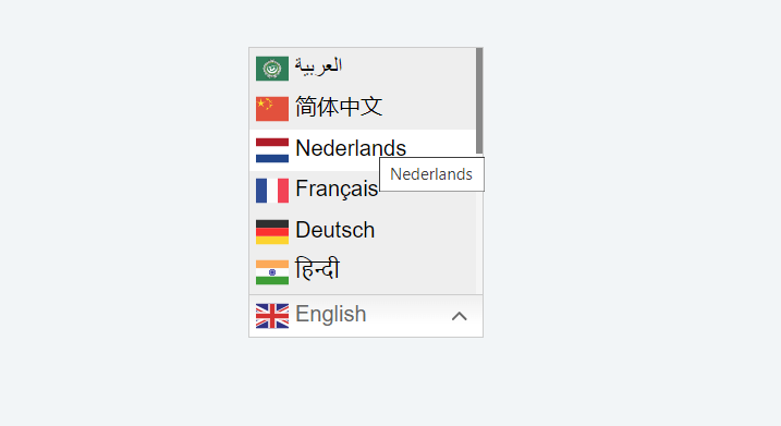
Tooltips play a significant role in enhancing the user experience of an application. They provide valuable information about various elements in the user interface, making interactions more intuitive and efficient. In this article, we will explore how to add tooltip to DevExpress ComboBox items, ensuring a smoother user experience for your application.
Contents
Understanding the Need for Tooltips
In user interface design, tooltips serve as valuable aids for users, especially in complex applications with numerous controls and features. They help users understand the purpose and functionality of different UI elements, reducing confusion and minimizing the learning curve.
Adding tooltips to DevExpress ComboBox items can significantly enhance the usability of your application by providing users with relevant information when they need it most. Whether it’s clarifying the meaning of an item or providing usage tips, tooltips contribute to a more intuitive and user-friendly interface.
Introduction to DevExpress ComboBox
DevExpress offers a powerful ComboBox control that allows developers to create sophisticated drop-down lists with ease. The DevExpress ComboBox provides extensive customization options, allowing developers to tailor its appearance and behavior to suit their application’s requirements.
The ComboBox control is commonly used in various scenarios, such as selecting from a list of options, filtering data, or entering text. With its rich feature set and flexibility, the DevExpress ComboBox is an invaluable tool for creating intuitive and efficient user interfaces.
Adding Tooltips to DevExpress ComboBox Items
Now, let’s dive into the process of adding tooltips to DevExpress ComboBox items. The following steps outline how to accomplish this task effectively:

- Identify the Items Requiring Tooltips: Determine which items in the ComboBox need tooltips and what information the tooltips should convey.
- Set the Tooltip Text: Assign descriptive text to each item’s tooltip using the appropriate properties or events provided by the DevExpress ComboBox control.
- Handle Tooltip Events: Implement event handlers to control the behavior of tooltips, such as when they should be displayed or hidden.
- Test Tooltip Functionality: Thoroughly test the tooltips in various scenarios to ensure they appear correctly and provide the intended information.
By following these steps, you can seamlessly integrate tooltips into your DevExpress ComboBox, enhancing its usability and guiding users effectively.
Example: Add Tooltip to Devexpress ComboBox Items
This Code Written inside the "GotFocus()" Client side event

for (i = 0; i < s.GetItemCount(); i++)
{
     var cmbitem = s.listBox.GetItemElement(i);
     cmbitem .title =s.GetItem(i).text;
}
Customizing Tooltip Appearance
In addition to adding tooltips to DevExpress ComboBox items, you may also want to customize their appearance to align with your application’s design theme. DevExpress offers extensive customization options for tooltips, allowing you to adjust various aspects such as:
- Tooltip Style: Choose from different predefined styles or create custom styles to match your application’s aesthetics.
- Font and Color: Specify the font, size, and color of the tooltip text to ensure readability and visual consistency.
- Animation Effects: Apply animation effects to tooltips to make them more engaging and visually appealing.
By customizing the appearance of tooltips, you can create a cohesive and visually pleasing user interface that enhances the overall user experience.
Handling Tooltip Events
DevExpress provides event handlers that allow you to control the behavior of tooltips in response to user actions. These events include:
- ToolTipOpening: Occurs when a tooltip is about to be displayed.
- ToolTipClosing: Occurs when a tooltip is about to be hidden.
- ToolTipShown: Occurs after a tooltip has been displayed.
- ToolTipHidden: Occurs after a tooltip has been hidden.
By handling these events, you can customize the tooltip behavior to meet the specific requirements of your application, ensuring a seamless and intuitive user experience.
Best Practices for Using Tooltips
When incorporating tooltips into your DevExpress ComboBox, it’s essential to follow best practices to maximize their effectiveness and usability. Some tips to keep in mind include:
- Keep it Concise: Keep tooltip text short and to the point to avoid overwhelming users with too much information.
- Use Clear Language: Use clear and understandable language in tooltips to ensure users can easily grasp the intended message.
- Provide Contextual Information: Tailor tooltip content to the specific context of the ComboBox item to make it more relevant and helpful.
- Avoid Clutter: Use tooltips sparingly and only when necessary to avoid cluttering the user interface and causing distraction.
By following these best practices, you can create tooltips that enhance user understanding and interaction within your DevExpress application.